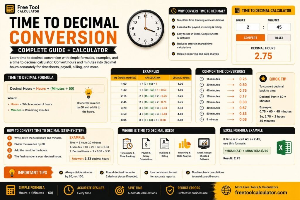
What Is a Font Size Converter?
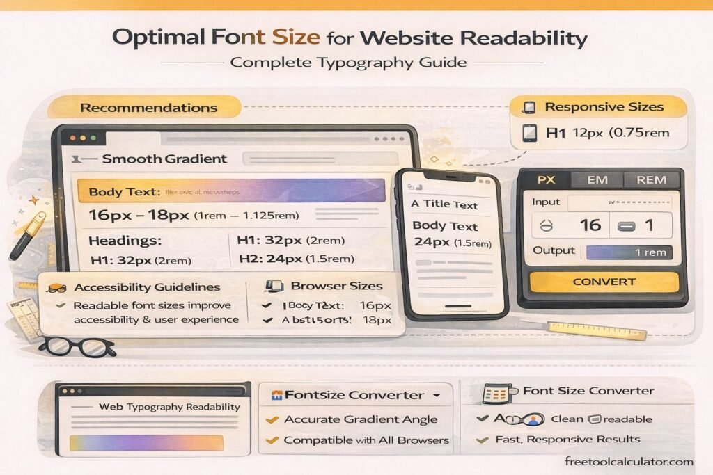
The Font Size Converter is an online utility that converts font sizes between different measurement units such as px, pt, em, rem, percent, vw, vh, cm, mm, in, and pc. It helps designers and developers translate typography measurements from one unit into another without manual calculations.
In modern web development, typography units vary depending on design systems, responsive layouts, and device scaling. A reliable font size converter simplifies this process by instantly converting units used in CSS, print design, and responsive interfaces.
Why Font Size Conversion Is Important
Different platforms and technologies use different measurement systems. For example, web typography often uses px, rem, or em, while print design commonly uses pt, cm, or inches. Converting between these units ensures consistency across devices, layouts, and display resolutions.
Developers frequently convert between font units when building responsive designs or implementing design systems created in tools like Figma or Adobe XD.
Common Font Size Units Explained
Pixels (px)
Pixels are the most commonly used unit in CSS for defining font size. They represent fixed screen units and provide precise control over typography.
Points (pt)
Points are commonly used in print design. One point equals 1/72 of an inch.
em
The em unit is relative to the font size of the parent element.
rem
rem stands for root em and is relative to the root HTML font size.
Percent (%)
Percentage values scale fonts relative to the parent element’s size.
Viewport Units (vw and vh)
Viewport width (vw) and viewport height (vh) units scale text relative to screen dimensions, enabling responsive typography.
Physical Units
Physical measurement units include cm (centimeters), mm (millimeters), in (inches), and pc (picas), which are mostly used in print layouts.
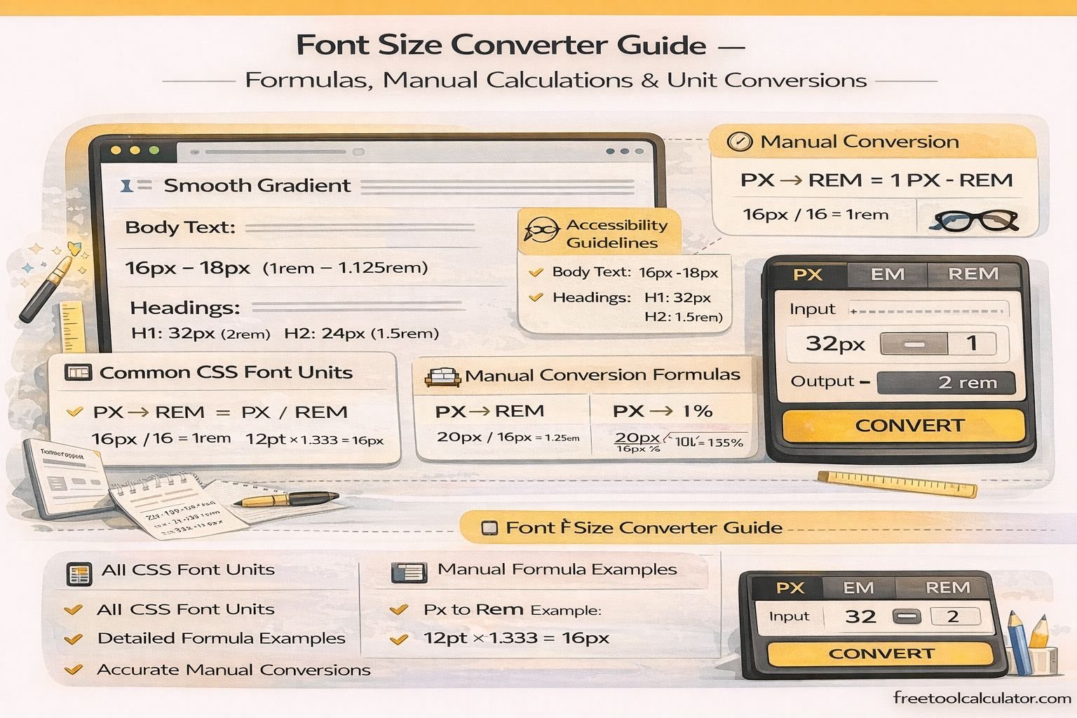
Manual Font Size Conversion Formulas
PX to REM Conversion
Formula:
rem = px ÷ root font size
Example:
If root font size = 16px
32px ÷ 16 = 2rem
Result:
32px = 2rem
REM to PX Conversion
Formula:
px = rem × root font size
Example:
1.5rem × 16px = 24px
PX to EM Conversion
Formula:
em = px ÷ parent font size
Example:
If parent size = 18px
27px ÷ 18 = 1.5em
EM to PX Conversion
Formula:
px = em × parent font size
Example:
1.25em × 16px = 20px
PX to PT Conversion
Since 1pt = 1/72 inch and 1px ≈ 1/96 inch, the common conversion ratio is:
pt = px × 0.75
Example:
16px × 0.75 = 12pt
Result:
16px = 12pt
PT to PX Conversion
Formula:
px = pt × 1.333
Example:
12pt × 1.333 ≈ 16px
PX to Percentage Conversion
Formula:
% = (px ÷ parent size) × 100
Example:
24px ÷ 16px × 100 = 150%
PX to Viewport Units
Viewport units depend on screen size.
1vw = 1% of viewport width
1vh = 1% of viewport height
Example:
If viewport width = 1200px
1vw = 12px
So:
24px = 2vw
PX to Physical Units
Since 1 inch = 96px:
PX to Inches
in = px ÷ 96
Example:
96px ÷ 96 = 1 inch
PX to Centimeters
1 inch = 2.54 cm
cm = px ÷ 37.795
PX to Millimeters
mm = px ÷ 3.7795
PX to Picas
1 pica = 12 points
pc = px ÷ 16
Example Manual Conversion Table
16px = 1rem
16px = 12pt
16px = 1em (if parent = 16px)
16px = 100%
16px ≈ 0.42cm
Challenges of Manual Conversion
While manual formulas are useful, converting multiple units repeatedly can be time-consuming and error-prone. Responsive design projects often require frequent conversions between px, rem, em, and percentage units.
Instead of calculating each conversion manually, developers often use a font size converter to instantly translate typography values into different measurement systems.
When Developers Use Font Size Conversion
Font size conversions are commonly required when:
– Converting design specs into CSS code
– Building responsive typography systems
– Implementing accessibility scaling
– Translating print typography into web formats
– Standardizing design systems
Best Practices for Using CSS Font Units
Use rem units for scalable typography based on root font size. This ensures consistent scaling across components.
Use em units for components that require relative scaling within containers.
Use viewport units carefully for responsive headings but avoid using them for long body text.
Always test typography across different screen sizes to maintain readability.
Conclusion
Understanding font size conversion formulas helps designers and developers control typography across different devices and design environments. By knowing how to manually convert px, pt, em, rem, percentages, viewport units, and physical measurements, you can maintain consistent typography across web and print projects.
For faster and more accurate results, using a dedicated font size converter simplifies these calculations and ensures precise conversions for modern responsive web design.