Bar Graph Maker – Create Custom Bar Charts & Download
A Bar Graph Maker is a simple yet powerful tool that helps you create clear, visually appealing bar charts in seconds. Whether you’re working with business data, school projects, reports, or presentations, this tool turns raw numbers into easy-to-understand visuals without requiring design or technical skills.
What Is a Bar Graph?
A bar graph displays data using rectangular bars, where the length or height of each bar represents a value. Bar charts are ideal for comparing quantities, tracking changes, and presenting data in a way that is quick to read and interpret.
How the Bar Graph Maker Works
A Bar Graph Maker allows users to enter labels and values, customize the chart appearance, and instantly generate a visual graph. You can adjust titles, axis labels, spacing, and orientation (vertical or horizontal) to match your needs.
Customization and Download Options
Most bar graph tools let users customize colors, fonts, and layouts for better clarity and branding. Once the chart is ready, you can download it as an image or file format suitable for presentations, reports, or sharing online.
Why Use a Bar Graph Maker?
Using a bar graph maker saves time and removes complexity. It helps present data clearly, improves understanding, and makes your content more engaging. It’s useful for students, marketers, analysts, teachers, and business owners alike.
Final Thoughts
A Bar Graph Maker makes data visualization fast and accessible. By creating custom bar charts and downloading them instantly, you can communicate insights more effectively and present information with confidence.
Bar Graph Maker – Create Custom Bar Charts and Download as PNG
A Bar Graph Maker is an easy-to-use tool that helps you create professional bar charts from your data within seconds. Whether you’re a student, teacher, business owner, marketer, researcher, analyst, or data enthusiast, bar graphs are one of the most effective ways to visualize information and compare values across categories.
Our free Bar Graph Maker allows you to enter data, preview the chart instantly, customize labels and values, copy chart details, and download your finished graph as a PNG image. Instead of manually building charts in spreadsheets or complicated software, you can create clean, presentation-ready bar graphs directly in your browser.
Bar charts remain one of the most trusted data visualization formats because they are simple to understand, easy to compare, and suitable for a wide range of educational, professional, and business applications.
What Is a Bar Graph?
A bar graph, also known as a bar chart, is a visual representation of data using rectangular bars. The length or height of each bar represents a value, making it easy to compare different categories at a glance.
Bar graphs are commonly used in reports, presentations, school projects, business dashboards, research papers, surveys, and statistical analysis because they transform raw numbers into clear visual insights.
How Bar Graphs Work
Each category is represented by a bar, while the value associated with that category determines the size of the bar. Larger values produce longer or taller bars, allowing viewers to quickly identify trends, comparisons, and differences.
Why Bar Graphs Are Popular
Bar graphs are among the most widely used chart types because they are easy to read and interpret. Even people with limited statistical knowledge can quickly understand information presented in a bar chart.
How to Use the Bar Graph Maker
Creating a custom bar graph is simple and requires only a few steps.
Step 1: Enter Your Data
Start by entering your categories and corresponding values. Categories may include products, months, departments, students, survey responses, expenses, sales figures, or any other measurable data.
Step 2: Customize Labels
Add a chart title, axis labels, and category names to make the graph easier to understand.
Step 3: Preview the Graph
The Bar Graph Maker generates a live preview instantly, allowing you to see how your chart will appear before downloading it.
Step 4: Review Your Data
Verify that all values are accurate and that the graph correctly represents your information.
Step 5: Download as PNG
Once you are satisfied with the chart, download it as a PNG image for use in presentations, reports, websites, assignments, and business documents.
Why Use a Bar Graph Instead of a Table?
While tables are useful for displaying precise numerical values, they often make comparisons difficult. A bar graph transforms those same numbers into a visual format that allows trends and differences to become immediately visible.
For example, comparing sales figures for ten products in a table requires reading each number individually. In a bar graph, the highest and lowest performers can be identified almost instantly.
Visual Comparison
Bar charts make it easy to compare categories side by side.
Improved Understanding
Graphs simplify complex information and make data more accessible to broader audiences.
Professional Presentation
Charts often look more engaging and professional in reports and presentations than raw data tables.
Common Uses for Bar Graphs
Bar graphs are used in nearly every industry because they provide a simple and effective way to communicate data.
Education
Students and teachers frequently use bar graphs to visualize test scores, survey results, attendance records, scientific experiments, and classroom projects.
Business Reporting
Businesses use bar charts to track revenue, sales performance, employee productivity, customer acquisition, inventory levels, and operational metrics.
Marketing Analysis
Marketing teams use bar graphs to compare campaign performance, traffic sources, advertising results, and conversion rates.
Research and Surveys
Researchers often present survey responses and study results using bar charts because they make findings easier to interpret.
Personal Finance
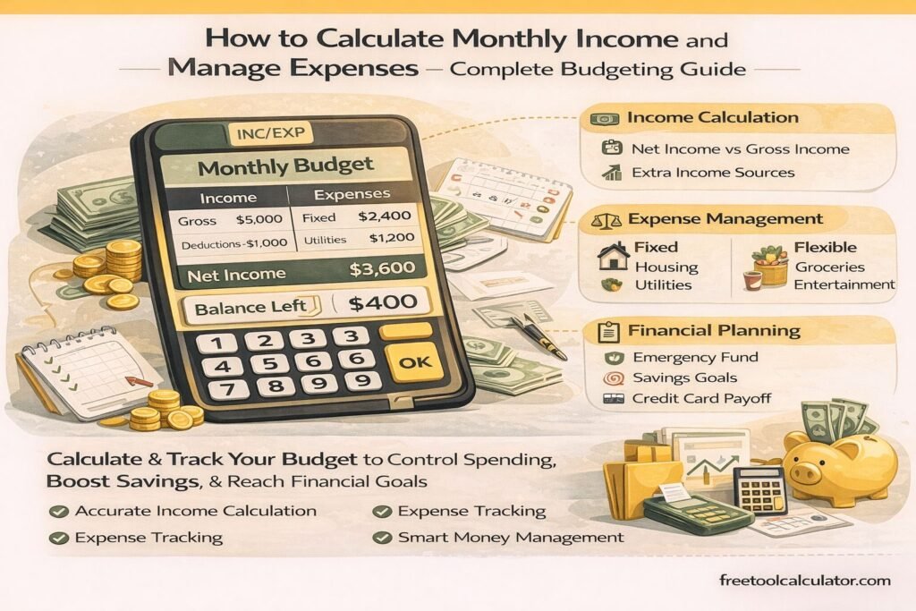
Individuals use bar graphs to visualize budgets, expenses, savings goals, and spending habits.
Types of Bar Graphs
Although all bar charts share the same basic concept, several variations exist depending on the type of data being presented.
Vertical Bar Graph
A vertical bar graph uses upright bars and is one of the most common chart styles. Categories appear along the horizontal axis while values are displayed vertically.
Horizontal Bar Graph
Horizontal bar charts display bars from left to right and are especially useful when category labels are long.
Grouped Bar Chart
Grouped bar charts compare multiple datasets across the same categories.
Stacked Bar Chart
Stacked bar charts show how individual components contribute to a total value.
Benefits of Using an Online Bar Graph Maker
Creating charts manually can be time-consuming, especially when formatting and customization are involved. An online Bar Graph Maker simplifies the entire process.
Fast Chart Creation
Generate charts within seconds without needing spreadsheet software or graphic design tools.
Instant Preview
See changes immediately as you update your data or customize chart settings.
Easy Customization
Modify titles, labels, values, and chart settings without starting over.
Downloadable Images
Export graphs as PNG images for easy sharing and presentation.
No Software Installation
The tool works directly in your browser without requiring downloads or subscriptions.
Best Practices for Creating Effective Bar Graphs
Following a few simple design principles can make your charts easier to understand and more visually appealing.
Use Clear Labels
Always label categories and values clearly so viewers understand what the chart represents.
Choose Meaningful Titles
A descriptive title helps readers immediately understand the purpose of the graph.
Keep Data Organized
Arrange categories logically to improve readability and interpretation.
Avoid Unnecessary Complexity
Simple charts are often more effective than overly complicated visualizations.
Bar Graphs in Education
Bar charts are an essential educational tool because they help students develop data interpretation and analytical skills.
Teachers frequently use bar graphs to explain statistics, probability, mathematics, science experiments, and social studies concepts. Students often create bar graphs for projects and assignments to present findings visually.
Mathematics Applications
Bar graphs help students understand comparisons, percentages, averages, and statistical relationships.
Science Projects
Researchers and students use bar charts to display experimental results and compare variables.
Bar Graphs in Business and Marketing
Businesses rely heavily on charts to communicate information effectively.
Sales Analysis
Sales teams use bar graphs to compare product performance, revenue trends, and regional sales figures.
Marketing Performance
Marketers often visualize campaign results using charts to identify successful strategies and areas for improvement.
Financial Reporting
Financial analysts use bar graphs to present budget allocations, revenue streams, and expense categories.
Why PNG Downloads Are Useful
PNG is one of the most popular image formats for charts because it provides high-quality graphics without significant loss of detail.
Easy Sharing
PNG files can be shared through email, presentations, websites, and documents.
High Quality
PNG images maintain clarity even when used in professional reports and printed materials.
Wide Compatibility
Almost all modern devices, browsers, and software applications support PNG files.
Common Mistakes When Creating Bar Graphs
Although bar graphs are relatively simple, certain mistakes can reduce their effectiveness.
Incorrect Data Entry
Even small data entry errors can result in misleading visualizations.
Missing Labels
Charts without titles or labels can confuse viewers and reduce clarity.
Too Many Categories
Including excessive categories can make a chart difficult to read and interpret.
Inconsistent Scales
Using inappropriate axis scales can distort comparisons and lead to incorrect conclusions.
Why Accurate Data Visualization Matters
Data visualization helps transform information into actionable insights. Accurate charts allow users to identify trends, compare performance, evaluate outcomes, and communicate findings effectively.
Whether you are preparing a classroom project, business presentation, research paper, marketing report, or financial analysis, a clear and accurate bar graph can improve understanding and support better decision-making.
Why Trust This Bar Graph Maker?
This Bar Graph Maker is designed to provide accurate, user-friendly, and professional chart generation. The tool focuses on simplicity, reliability, and accessibility so users can create high-quality visualizations without advanced technical skills.
The generated charts are suitable for educational, professional, and personal use, making the tool valuable for students, teachers, researchers, business professionals, marketers, and analysts.
Create Your Bar Graph Today
Use our free Bar Graph Maker to create custom bar charts from your data, preview results instantly, copy chart details, and download professional PNG images in seconds. Whether you’re analyzing business metrics, presenting research findings, tracking finances, or completing a school project, this tool provides a fast and reliable way to visualize data effectively.
Enter your data, customize your chart, and create a professional-quality bar graph today.