How to Apply Gradient to Text with CSS Background-Clip

How to Apply Gradient to Text with CSS Background-Clip

How to Apply a Gradient to Text: Mastering the Background-Clip Trick

For years, web designers have been captivated by the sleek, modern look of gradient text. It’s a technique that transforms a standard heading into a vibrant piece of visual art, making it stand out without relying on heavy images or complex SVG files. While applying a gradient to a background is straightforward, making that gradient fill the text itself requires a specific, elegant combination of CSS properties.

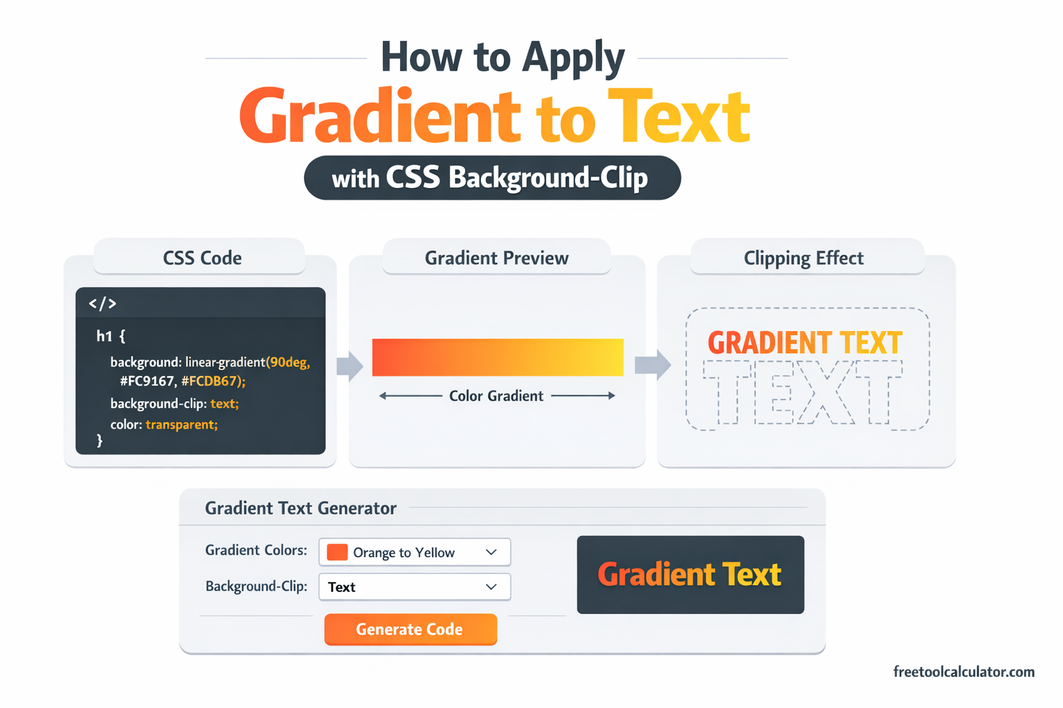
This effect relies on three core ingredients: a gradient background, the background-clip property, and a transparent text color. When these three elements work together, the result is text that appears to be painted with your chosen gradient, while remaining fully selectable, accessible, and scalable.

The Foundation: Setting the Stage

Before we apply the gradient to the text, we need to establish the element we are styling. Typically, this is a heading (<h1>) or a paragraph (<p>). The first step is to apply a gradient as the element’s background.

A CSS gradient is not a color but an image generated by the browser. You can create a linear gradient that transitions between several colors. For example:

.gradient-text {
    background-image: linear-gradient(to right, #ff7e5e, #feb47b);
}

At this point, if you apply this class to an element, you will see the gradient fill the entire background of the element. The text sits on top of it, likely in its default black color, obscuring the gradient effect we want. We need to change that relationship.

The Key: Making the Text Transparent

The first part of the solution is to make the text color transparent. By setting color: transparent, we remove the foreground color of the text, allowing whatever is behind the text—in this case, our gradient—to show through.

However, there is a common pitfall here. Using color: transparent alone will make the text invisible, but the background gradient will still be confined to the element’s entire background area, including the space between lines and around the text. The gradient will appear behind the text, but it won’t be clipped to the shape of the letters. This leads to a messy look where the gradient fills the entire bounding box, and the text acts like a window cut out of that gradient.

This is where the magic of background-clip comes in.

The Magic: Background-Clip: Text

The background-clip property in CSS determines how far a background (color or image) extends within an element. The standard values are border-box, padding-box, and content-box. However, there is a non-standard but widely supported value that changes everything: text.

When you set background-clip: text, you instruct the browser to clip the background image (in this case, our gradient) to exactly the shape of the text characters. The background only appears where the text outlines exist. Combined with color: transparent, the background becomes the visible color of the text.

Here is the complete CSS code that brings the effect to life:

.gradient-text {
    background-image: linear-gradient(120deg, #a18cd1, #fbc2eb);
    background-clip: text;
    color: transparent;
}

With just these three lines, the gradient is no longer a background element behind the text; it becomes the text itself. The letters now showcase the smooth transition from one color to the next.

Why This Combination Works

Understanding why this works requires looking at how the browser renders layers. An HTML element can be thought of as having layers. The bottom layer is the background, and the top layer is the content (text and child elements).

By default:

  1. The background (gradient) fills the entire element box.
  2. The text (colored black) sits on top, covering the background.

When we apply our technique:

  1. We set color: transparent. This effectively makes the text layer invisible.
  2. We set background-clip: text. This tells the browser to take the background image and restrict its painting area to the silhouettes of the text glyphs from the invisible text layer.

The result is a reversal of the usual roles: the background is now visible only in the shape of the text, and the rest of the element’s background area remains transparent (or whatever background color is set on the parent).

Browser Support and Vendor Prefixes

This technique is robust, but it requires attention to browser support. The background-clip: text property is a WebKit-originated feature. For maximum compatibility, especially with older browsers, it is essential to include the -webkit- vendor prefix.

The standard background-clip: text is defined in the CSS Backgrounds and Borders Module Level 4, but as of now, it is still widely implemented with the prefix. Therefore, the safest production-ready code looks like this:

.gradient-text {
    background-image: linear-gradient(135deg, #667eea, #764ba2);
    -webkit-background-clip: text;
    background-clip: text;
    color: transparent;
}

Browsers that do not support background-clip: text will ignore the prefixed and standard properties, but they will still apply color: transparent. In this fallback scenario, the text would become invisible. To prevent this, you should ensure a fallback color is set on a parent element, or use a @supports query to only apply the transparency when the feature is supported.

Practical Considerations and Best Practices

Applying gradients to text is visually striking, but it should be done with accessibility and usability in mind.

1. Maintain Sufficient Contrast

Gradients can sometimes create low-contrast areas, especially if the gradient transitions from a light color to another light color. Always test your text against its background. Since the text is technically transparent, the background behind the element becomes crucial. The gradient text must have enough contrast with the page’s background color to remain readable.

2. Fallbacks for Older Browsers

While most modern browsers support background-clip: text with the prefix, it is wise to provide a fallback for older systems. You can use a @supports feature query to apply the effect only when supported, leaving a solid color for unsupported browsers.

.gradient-text {
    color: #764ba2; /* Fallback solid color */
}

@supports (background-clip: text) or (-webkit-background-clip: text) {
    .gradient-text {
        background-image: linear-gradient(135deg, #667eea, #764ba2);
        -webkit-background-clip: text;
        background-clip: text;
        color: transparent;
    }
}

3. Performance and Animations

Gradient text performs well in modern browsers, but be cautious with animations. Animating the background-position of a gradient text element can create a shimmering effect, which is popular. However, this can be resource-intensive on lower-end devices. If you animate, use transform and will-change sparingly and test performance.

4. Selectability and SEO

One of the greatest advantages of this technique is that it preserves the text as actual text. Users can select, copy, and paste the gradient text, and search engines can index it normally. This is far superior to using images for stylized text.

Creating Complex Gradients

The linear gradient used above is just the starting point. You can leverage the full power of CSS gradients to create more complex text effects.

  • Radial Gradients: Use radial-gradient(circle, #ff9a9e, #fad0c4) to create a spotlight effect that radiates from the center of the text.
  • Conic Gradients: Implement conic-gradient(from 90deg at 25% 50%, #f9f047, #f9f047, #b3e6f5, #f9f047) for a pie-chart-like transition across each character.
  • Multiple Color Stops: Instead of two colors, use multiple stops for a rainbow or metallic effect. For example: linear-gradient(90deg, red, orange, yellow, green, blue, indigo, violet).
  • Repeating Gradients: Use repeating-linear-gradient to create striped or patterned text.

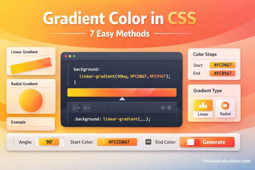
To simplify the process of generating complex gradient combinations, you can use tools that provide a visual interface. For designers and developers who want to experiment with different angles, color stops, and gradient types, a dedicated CSS gradient generator can streamline the workflow. You can find an intuitive tool at Free Tool Calculator CSS Gradient Generator to create and export the gradient code for your text effects.

Going Further: Advanced Effects

Once you have mastered the basic gradient text, you can layer additional effects to enhance the design.

Combining with Shadows

The text-shadow property works beautifully with gradient text. Since the text color is transparent, the shadow is cast from the shape of the text. Adding a subtle, dark shadow can improve readability against busy backgrounds or add a sense of depth.

.gradient-text {
    background-image: linear-gradient(to right, gold, orange);
    -webkit-background-clip: text;
    background-clip: text;
    color: transparent;
    text-shadow: 2px 2px 4px rgba(0,0,0,0.3);
}

Animating Gradients

You can create a moving gradient effect by animating the background-position of a larger gradient. This is often called a “shimmer” effect. Remember that since the gradient is clipped to the text, the movement creates a dynamic, eye-catching animation.

@keyframes shimmer {
    0% { background-position: 0% 50%; }
    100% { background-position: 100% 50%; }
}

.animated-gradient-text {
    background-image: linear-gradient(90deg, #ff8a00, #e52e71, #ff8a00);
    background-size: 200% auto;
    -webkit-background-clip: text;
    background-clip: text;
    color: transparent;
    animation: shimmer 3s linear infinite;
}

Applying to Inline Elements

This technique is not limited to block-level elements. You can apply it to inline elements like <span>, or even links (<a>). This is particularly useful for highlighting keywords or creating branded buttons with gradient text.

Conclusion

Applying a gradient to text using background-clip: text and color: transparent is a powerful technique that bridges the gap between visual design and semantic markup. It allows designers to create rich, modern typography without sacrificing accessibility, SEO, or performance.

The method relies on understanding that a background image can be clipped to the shape of text, effectively turning the background into the foreground. By combining a gradient background, the -webkit-background-clip: text property, and transparent text, you achieve a sleek effect that elevates standard typography.

As with any advanced CSS technique, it is important to consider browser support, provide sensible fallbacks, and ensure that readability remains the top priority. When executed thoughtfully, gradient text becomes a versatile tool in any web designer’s arsenal, enabling the creation of memorable, engaging user interfaces that stand out with minimal overhead.

Share this article:

On This Page

Subscribe to our newsletter

Read the latest articles from our experts

Related Posts

legal paper size measurement in inches and cm

What Is Standard Printer Paper Size? Letter Dimensions Explained (8.5×11 Guide)

Standard printer paper size in the United States is Letter size, which measures 8.5 × 11 inches. This guide explains normal printer paper dimensions, compares Letter with A4 and Legal paper, and helps you understand paper sizes for home printing, office documents, school assignments, and design projects.

How to Make Red Color (Complete Mixing Guide) Paint, Digital & Print Methods Explained

How to Make Red Color (Complete Mixing Guide): Paint, Digital & Print Methods Explained

Red is one of the most recognizable primary colors, but many people wonder whether it can be mixed or recreated using other colors. This guide explains how red works in traditional color theory, digital design, and printing while covering paint mixing, RGB, CMYK, and practical color applications for artists and designers.

CMYK to RGB Conversion Guide (Design & Print Colors) Understanding Digital and Print Color Models

CMYK to RGB Conversion Guide (Design & Print Colors): Understanding Digital and Print Color Models

Understanding the difference between CMYK and RGB is essential for designers, printers, photographers, and marketers. This guide explains how CMYK to RGB conversion works, compares popular color models, provides conversion formulas, and helps you choose the right format for both digital screens and professional printing projects.

PPC Budget Calculator Guide: How to Calculate Your Google Ads Budget & Maximize ROI

PPC Budget Calculator Guide: How to Calculate Your Google Ads Budget & Maximize ROI

Planning your advertising budget is essential for running profitable PPC campaigns. This guide explains how to calculate a PPC budget, estimate Google Ads costs, understand CPC and ROI, and use a budget calculator to make smarter advertising decisions while controlling costs and improving campaign performance.

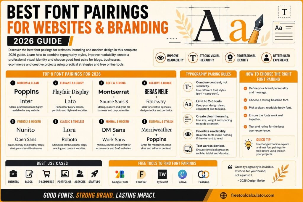
Best Font Pairings for Websites and Branding 2026 Guide

Best Font Pairings for Websites and Branding 2026 Guide

Discover the best font pairings for websites branding and modern design in this complete 2026 guide Learn how to combine typography styles improve readability create professional visual identity and choose good font pairs for blogs businesses ecommerce and creative projects using practical design strategies and free online tools effectively

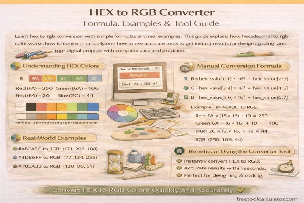
HEX to RGB Converter Formula Examples and Tool Guide

HEX to RGB Converter Formula Examples and Tool Guide

Learn hex to rgb conversion with simple formulas and real examples This guide explains how hexadecimal to rgb color works, how to convert manually, and how to use accurate tools to get instant results for design, coding, and digital projects with complete ease and precision

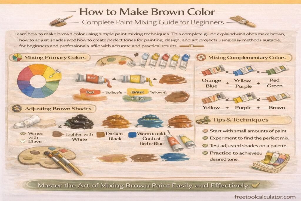
How to Make Brown Color Complete Paint Mixing Guide for Beginners

How to Make Brown Color Complete Paint Mixing Guide for Beginners

Learn how to make brown color using simple paint mixing techniques This complete guide explains what colors make brown, how to adjust shades, and how to create perfect tones for painting, design, and art projects using easy methods suitable for beginners and professionals alike with accurate and practical results

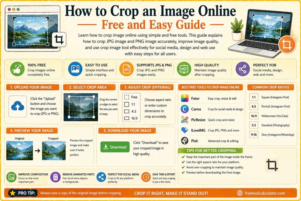
How to Crop an Image Online Free and Easy Guide

How to Crop an Image Online Free and Easy Guide

Learn how to crop image online using simple and free tools This guide explains how to crop jpg image and png image accurately improve image quality and use crop image tool effectively for social media design and web use with easy steps for all users

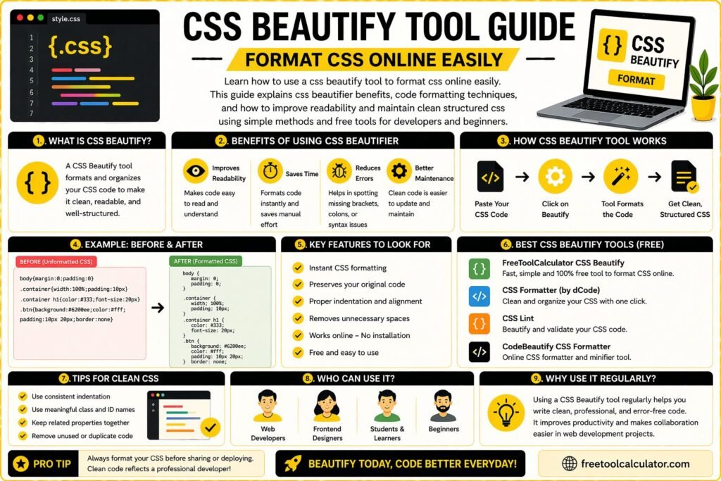
CSS Beautify Tool Guide Format CSS Online Easily

CSS Beautify Tool Guide Format CSS Online Easily

Learn how to use a css beautify tool to format css online easily This guide explains css beautifier benefits, code formatting techniques, and how to improve readability and maintain clean structured css using simple methods and free tools for developers and beginners

Social Media Video Sizes Guide All Platforms 2026

Social Media Video Sizes Guide All Platforms 2026

Learn social media video sizes for all major platforms in 2026 This guide explains video dimensions formats and aspect ratios to help you create perfect videos for Instagram YouTube TikTok and more ensuring high quality uploads better engagement and professional results across all devices and platforms easily

How to Create Favicon for Website Step by Step Guide

How to Create Favicon for Website Step by Step Guide

Learn how to create favicon for website using simple step by step methods This guide explains how to make icon for website, choose the right size and format, and use free tools to generate professional favicons for branding and better user experience across all devices and browsers easily

Animated Gradient Background Generator Create Stunning CSS Backgrounds Easily

Animated Gradient Background Generator: Create Stunning CSS Backgrounds Easily

Want to create smooth, modern website backgrounds without writing complex CSS from scratch? This guide explains how an animated gradient background generator works, why designers use it, and how to create eye-catching moving gradients for websites, landing pages, and hero sections. You will also see practical tips and common mistakes.

Font Size Converter Guide – Formulas, Manual Calculations & Unit Conversions

Font Size Converter Guide – Formulas, Manual Calculations & Unit Conversions

This font size converter guide explains how to manually convert font sizes between px, pt, em, rem, percent, vw, vh, cm, mm, inches, and picas. Learn formulas, calculation methods, and practical examples for accurate typography conversions used in responsive web design, print layouts, and modern CSS development workflows across devices and screen sizes.

Optimal Font Size for Website Readability – Complete Typography Guide

Optimal Font Size for Website Readability – Complete Typography Guide

This font size converter guide explains the optimal font size for website readability. Learn recommended typography sizes, accessibility guidelines, and responsive font practices for web design. Discover how to choose body text, headings, and mobile font sizes while converting units like px, em, and rem to maintain consistent, readable typography across devices.

CSS Gradients in Web Design – Performance, Best Practices & Browser Support

How to Convert Figma Gradient to CSS Code – Complete Developer Guide

This CSS gradient generator guide explains how to convert Figma gradients into CSS code accurately. Learn how to extract color stops, angles, and gradient types from Figma, convert them into linear or radial CSS gradients, and optimize them for responsive web design, browser compatibility, and performance using efficient development techniques and tools.

CSS Gradients in Web Design – Performance, Best Practices & Browser Support

CSS Gradients in Web Design – Performance, Best Practices & Browser Support

This CSS gradient generator guide explains performance impacts, best practices, and browser support for modern CSS gradients. Learn how to optimize gradient rendering, improve website speed, ensure cross-browser compatibility, and create visually appealing backgrounds using efficient CSS techniques for responsive and high-performance web design across all devices and screen sizes globally.

Tools & Resources

Explore our collection of professional tools designed to streamline your workflow

Report a Bug