Optimal Font Size for Website Readability – Complete Typography Guide

Optimal Font Size for Website Readability – Complete Typography Guide

Optimal Font Size for Website Readability

Typography plays a crucial role in user experience and web accessibility. Choosing the optimal font size ensures that website content is easy to read across different devices, screen sizes, and viewing conditions. Many designers rely on a structured typography system combined with tools like a font size converter to maintain consistent font scaling using units such as px, rem, and em. Understanding recommended font sizes, readability standards, and responsive typography practices helps create websites that are both accessible and visually balanced.

Recommended Font Size for Body Text

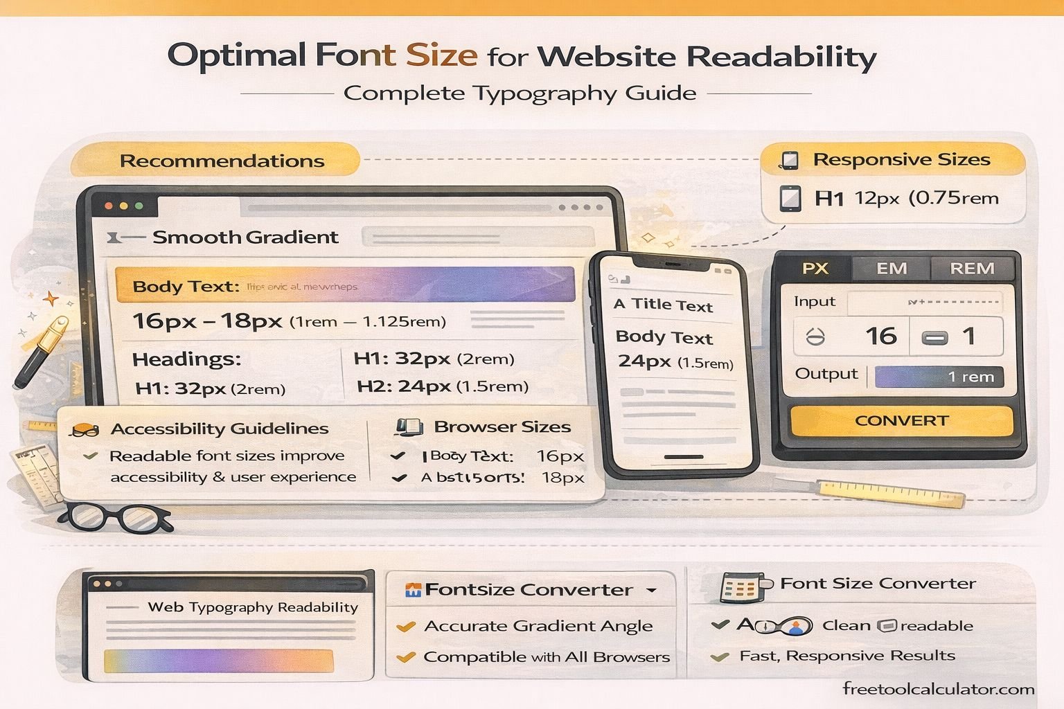
For most websites, the commonly recommended font size for body text is 16px. This size provides comfortable readability for the majority of users across desktops and mobile devices. Accessibility and design guidelines frequently suggest starting with a base size equivalent to 12pt or 16px because it is readable on most screens.

Using smaller text sizes can make content difficult to read, especially for users with vision impairments or when viewing content on high-resolution displays. Many accessibility resources recommend maintaining a minimum body text size of 16px to ensure readability without requiring zoom.

If you need to convert font units between px, em, rem, or pt for responsive design, a font size converter helps ensure accurate scaling across browsers and devices.

Recommended Typography Scale for Websites

A clear typography hierarchy improves content scanning and user experience. Designers typically use a scalable system to maintain consistency across headings and body text.

Typical Font Size Structure

H1 Heading: 32px – 40px
H2 Heading: 24px – 32px
H3 Heading: 20px – 24px
Body Text: 16px – 18px
Captions / Small Text: 12px – 14px

This hierarchy creates a visual structure that guides readers through the content while maintaining readability.

Font Size for Mobile Readability

Mobile typography requires careful consideration because users view content on smaller screens. A body text size of around 16px is generally recommended for mobile devices to prevent users from needing to zoom.

In responsive design, fonts should scale proportionally across devices. Using relative units such as rem or em instead of fixed pixel values allows typography to adapt automatically to screen sizes.

Example Responsive CSS

html { font-size: 16px; }<br> body { font-size: 1rem; }<br> h1 { font-size: 2rem; }<br> h2 { font-size: 1.5rem; }

Developers often convert pixel values into rem units using a font size converter tool to maintain consistent typography across layouts.

Accessibility Considerations for Font Size

Accessibility standards emphasize readable text and scalable layouts. While guidelines do not mandate a strict minimum font size, they recommend that users must be able to resize text up to 200% without losing content or functionality.

Accessibility best practices also include:

– Base font size of at least 16px
– Line height around 1.5× the font size
– Sufficient contrast between text and background
– Avoiding overly condensed or decorative fonts

Proper typography ensures that websites remain usable for people with visual impairments and improves readability for all users.

Line Height and Spacing for Better Readability

Font size alone does not determine readability. Proper spacing between lines and paragraphs significantly improves text clarity.

A good rule of thumb is to set the line height to approximately 1.5 times the font size. For example, if body text is 16px, the line height should be about 24px.

Proper spacing prevents text blocks from appearing cramped and helps readers maintain focus when scanning long paragraphs.

Why Responsive Typography Matters

Modern websites are viewed on a wide range of devices, including smartphones, tablets, laptops, and large monitors. Responsive typography ensures that text remains readable across all screen sizes.

Key techniques include:

– Using rem or em units instead of fixed pixels
– Applying media queries for typography scaling
– Maintaining consistent spacing ratios
– Testing readability across devices

Tools such as a font size converter help developers quickly convert between px, rem, em, and pt units when implementing responsive typography systems.

Common Typography Mistakes in Web Design

Many websites suffer from readability problems due to poor typography choices. Some common mistakes include:

– Using font sizes below 14px for body text
– Excessively long line lengths
– Low contrast between text and background
– Too many font families on one page
– Ignoring mobile readability

A clear typography strategy prevents these issues and improves overall user experience.

Choosing the Right Font Type

Font size works best when paired with readable typefaces. Sans-serif fonts such as Arial, Roboto, and Open Sans are commonly used for digital interfaces because they remain clear on screens.

Key characteristics of readable web fonts include:

– Large x-height
– Clear character shapes
– Balanced letter spacing
– Good rendering on different displays

Using Font Size Conversion in Web Development

Developers frequently need to convert font units when building responsive layouts. Common conversions include:

– px to rem
– px to em
– pt to px
– rem to px

Instead of calculating manually, using a font size converter simplifies these conversions and helps maintain consistent typography across your entire website.

Conclusion

The optimal font size for website readability typically starts at 16px for body text, with larger sizes used for headings and smaller sizes reserved for captions or metadata. Combined with proper spacing, responsive units, and accessible design principles, the right font size improves readability, usability, and overall user experience.

By applying typography best practices and using tools to manage font unit conversions, developers and designers can create websites that remain clear, scalable, and accessible across all devices.

Share this article:

On This Page

Subscribe to our newsletter

Read the latest articles from our experts

Related Posts

legal paper size measurement in inches and cm

What Is Standard Printer Paper Size? Letter Dimensions Explained (8.5×11 Guide)

Standard printer paper size in the United States is Letter size, which measures 8.5 × 11 inches. This guide explains normal printer paper dimensions, compares Letter with A4 and Legal paper, and helps you understand paper sizes for home printing, office documents, school assignments, and design projects.

How to Make Red Color (Complete Mixing Guide) Paint, Digital & Print Methods Explained

How to Make Red Color (Complete Mixing Guide): Paint, Digital & Print Methods Explained

Red is one of the most recognizable primary colors, but many people wonder whether it can be mixed or recreated using other colors. This guide explains how red works in traditional color theory, digital design, and printing while covering paint mixing, RGB, CMYK, and practical color applications for artists and designers.

CMYK to RGB Conversion Guide (Design & Print Colors) Understanding Digital and Print Color Models

CMYK to RGB Conversion Guide (Design & Print Colors): Understanding Digital and Print Color Models

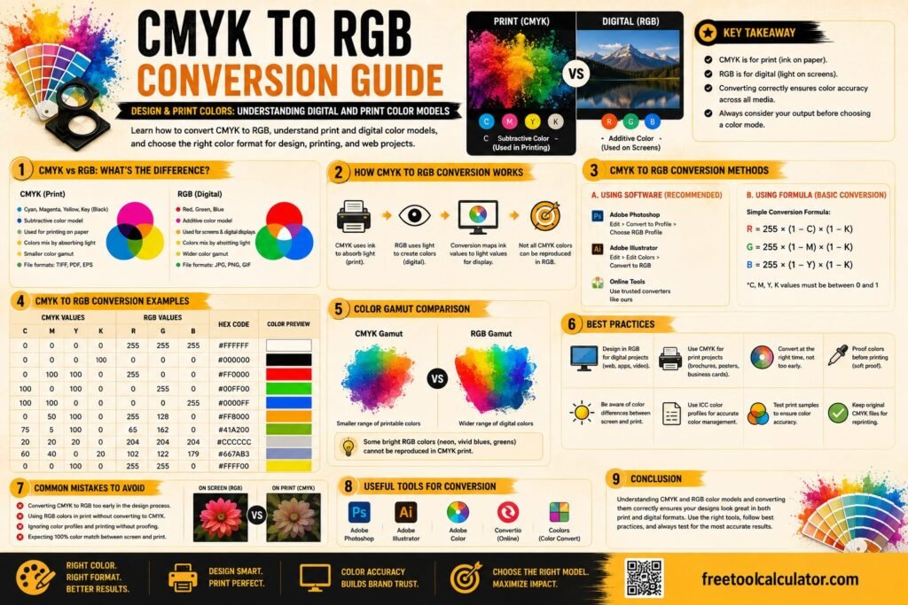
Understanding the difference between CMYK and RGB is essential for designers, printers, photographers, and marketers. This guide explains how CMYK to RGB conversion works, compares popular color models, provides conversion formulas, and helps you choose the right format for both digital screens and professional printing projects.

PPC Budget Calculator Guide: How to Calculate Your Google Ads Budget & Maximize ROI

PPC Budget Calculator Guide: How to Calculate Your Google Ads Budget & Maximize ROI

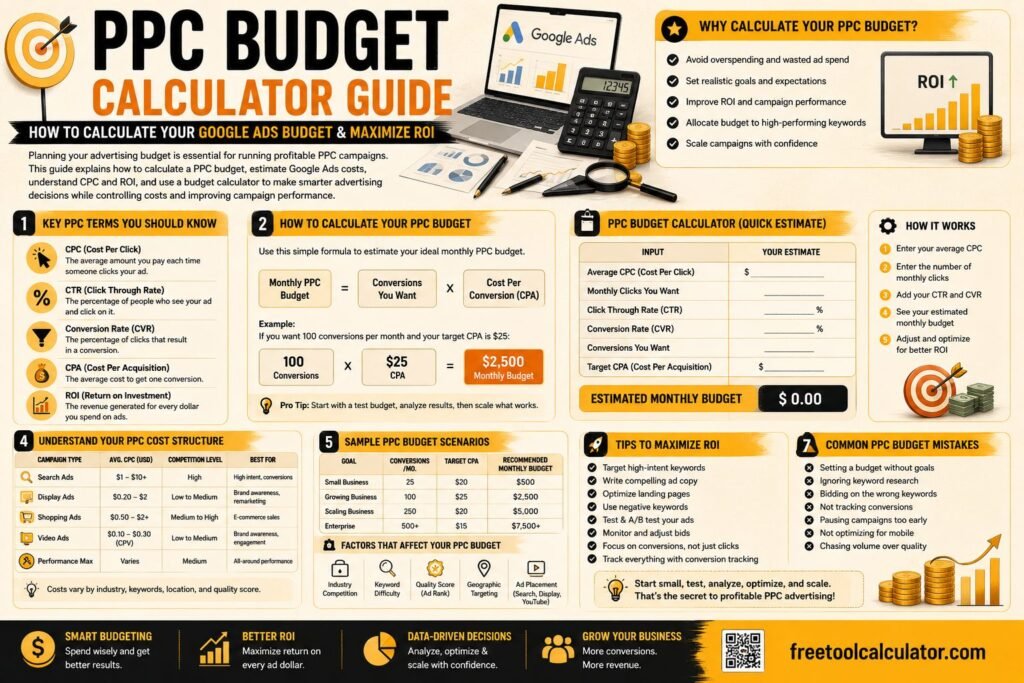
Planning your advertising budget is essential for running profitable PPC campaigns. This guide explains how to calculate a PPC budget, estimate Google Ads costs, understand CPC and ROI, and use a budget calculator to make smarter advertising decisions while controlling costs and improving campaign performance.

Best Font Pairings for Websites and Branding 2026 Guide

Best Font Pairings for Websites and Branding 2026 Guide

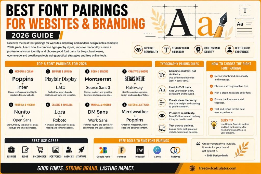
Discover the best font pairings for websites branding and modern design in this complete 2026 guide Learn how to combine typography styles improve readability create professional visual identity and choose good font pairs for blogs businesses ecommerce and creative projects using practical design strategies and free online tools effectively

HEX to RGB Converter Formula Examples and Tool Guide

HEX to RGB Converter Formula Examples and Tool Guide

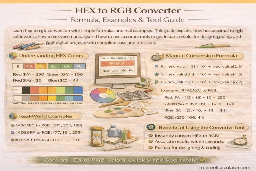
Learn hex to rgb conversion with simple formulas and real examples This guide explains how hexadecimal to rgb color works, how to convert manually, and how to use accurate tools to get instant results for design, coding, and digital projects with complete ease and precision

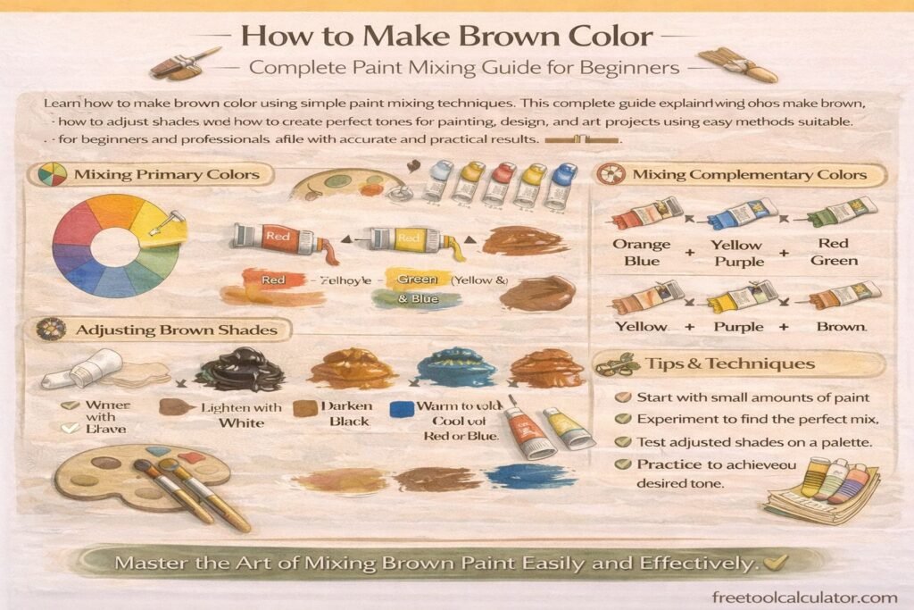
How to Make Brown Color Complete Paint Mixing Guide for Beginners

How to Make Brown Color Complete Paint Mixing Guide for Beginners

Learn how to make brown color using simple paint mixing techniques This complete guide explains what colors make brown, how to adjust shades, and how to create perfect tones for painting, design, and art projects using easy methods suitable for beginners and professionals alike with accurate and practical results

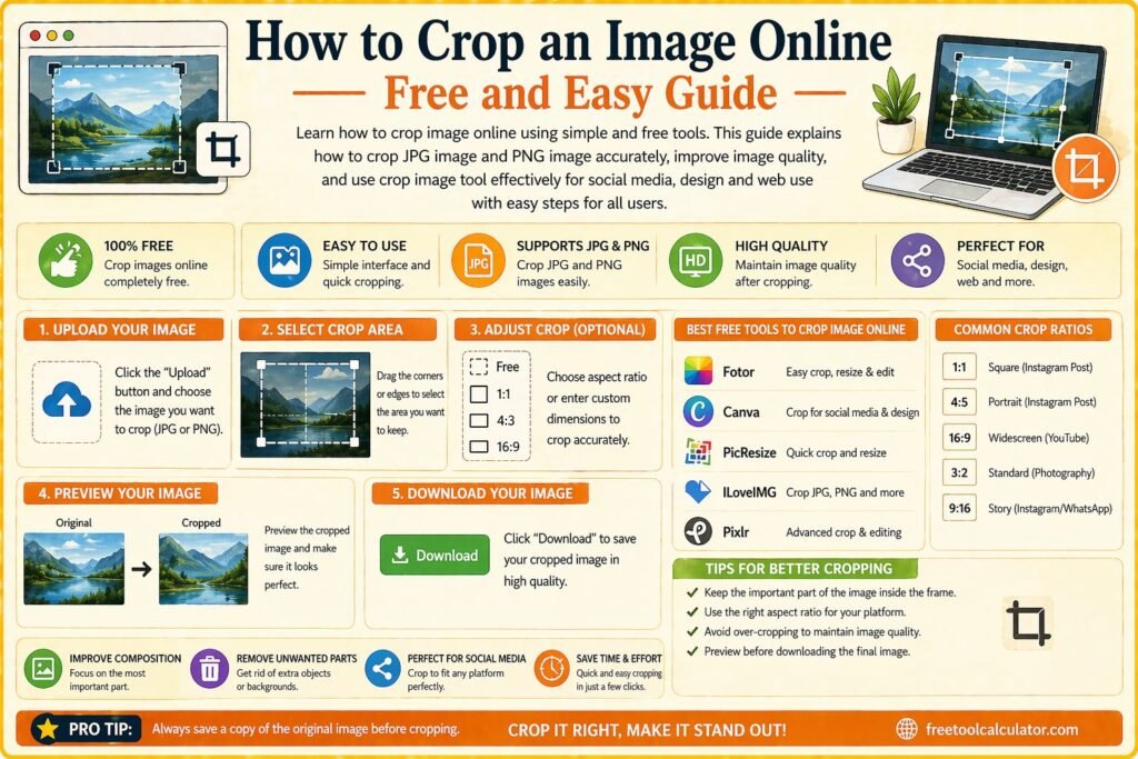
How to Crop an Image Online Free and Easy Guide

How to Crop an Image Online Free and Easy Guide

Learn how to crop image online using simple and free tools This guide explains how to crop jpg image and png image accurately improve image quality and use crop image tool effectively for social media design and web use with easy steps for all users

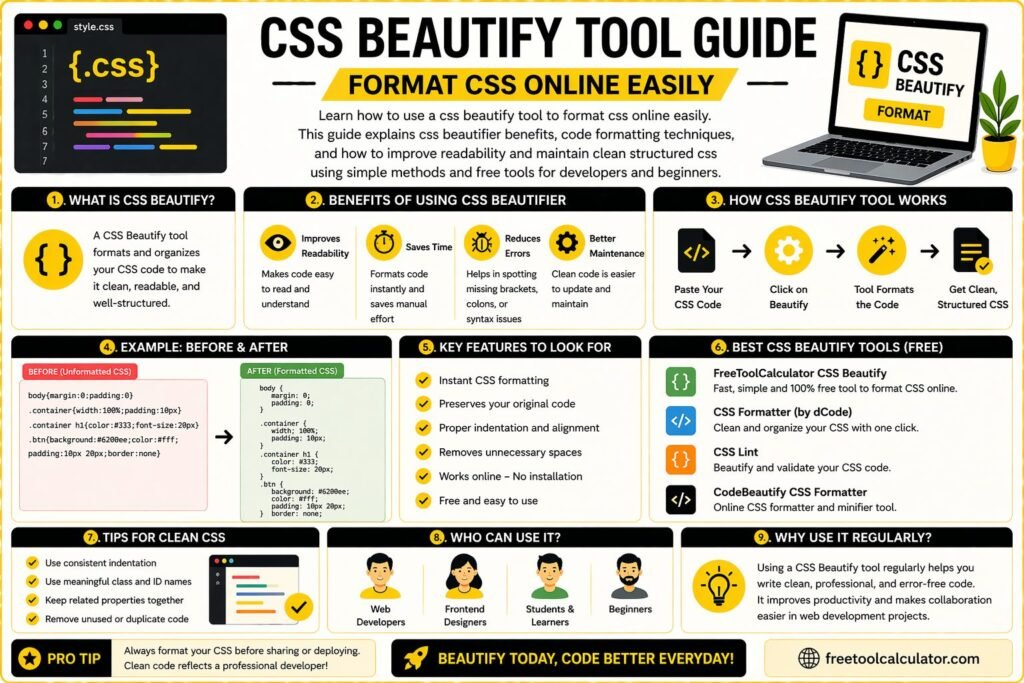
CSS Beautify Tool Guide Format CSS Online Easily

CSS Beautify Tool Guide Format CSS Online Easily

Learn how to use a css beautify tool to format css online easily This guide explains css beautifier benefits, code formatting techniques, and how to improve readability and maintain clean structured css using simple methods and free tools for developers and beginners

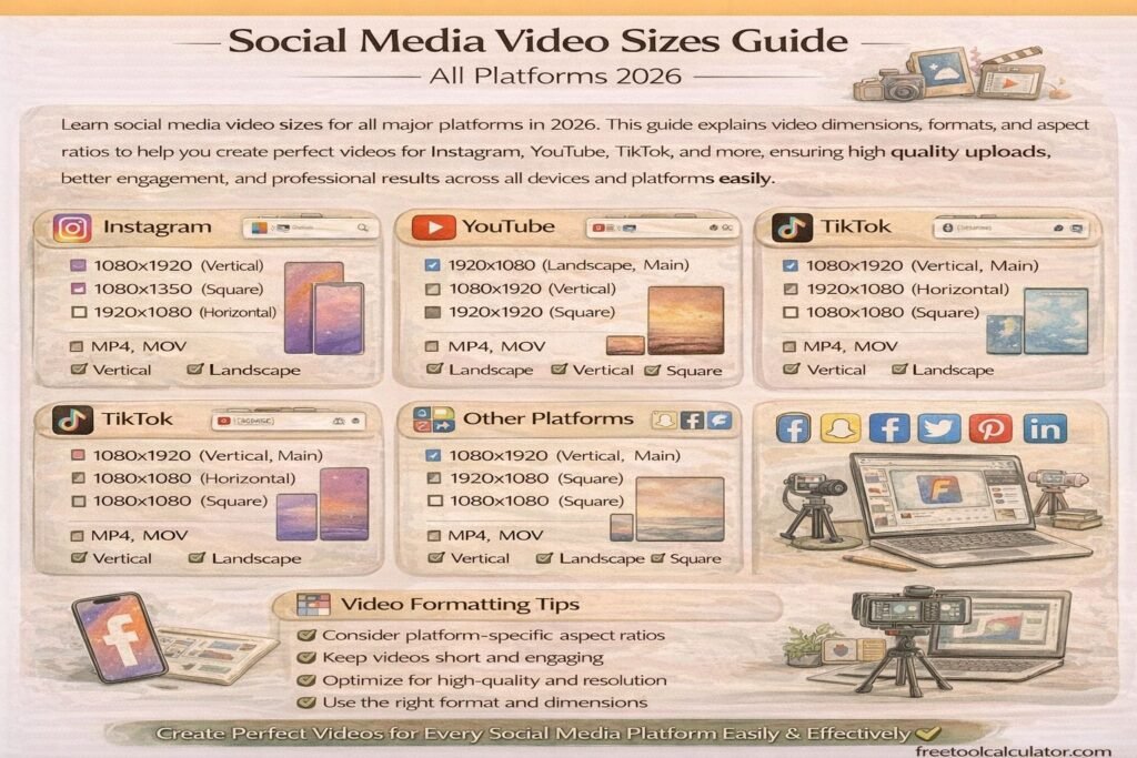
Social Media Video Sizes Guide All Platforms 2026

Social Media Video Sizes Guide All Platforms 2026

Learn social media video sizes for all major platforms in 2026 This guide explains video dimensions formats and aspect ratios to help you create perfect videos for Instagram YouTube TikTok and more ensuring high quality uploads better engagement and professional results across all devices and platforms easily

How to Create Favicon for Website Step by Step Guide

How to Create Favicon for Website Step by Step Guide

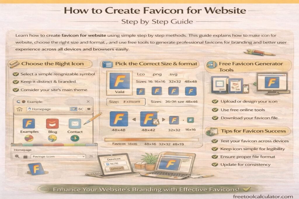
Learn how to create favicon for website using simple step by step methods This guide explains how to make icon for website, choose the right size and format, and use free tools to generate professional favicons for branding and better user experience across all devices and browsers easily

How to Apply Gradient to Text with CSS Background-Clip

How to Apply Gradient to Text with CSS Background-Clip

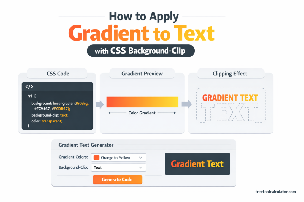
Master the CSS gradient text technique using background-clip: text and transparent text color. Learn how to create stunning typography effects that remain accessible, selectable, and SEO-friendly with practical code examples and browser support guidance.

Animated Gradient Background Generator Create Stunning CSS Backgrounds Easily

Animated Gradient Background Generator: Create Stunning CSS Backgrounds Easily

Want to create smooth, modern website backgrounds without writing complex CSS from scratch? This guide explains how an animated gradient background generator works, why designers use it, and how to create eye-catching moving gradients for websites, landing pages, and hero sections. You will also see practical tips and common mistakes.

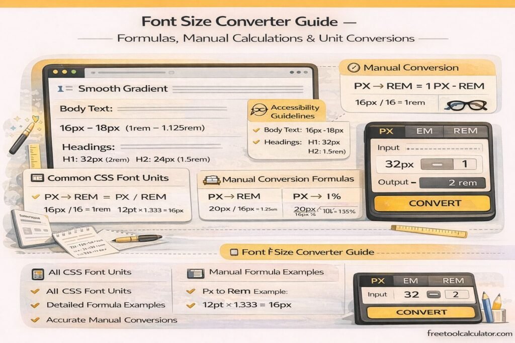
Font Size Converter Guide – Formulas, Manual Calculations & Unit Conversions

Font Size Converter Guide – Formulas, Manual Calculations & Unit Conversions

This font size converter guide explains how to manually convert font sizes between px, pt, em, rem, percent, vw, vh, cm, mm, inches, and picas. Learn formulas, calculation methods, and practical examples for accurate typography conversions used in responsive web design, print layouts, and modern CSS development workflows across devices and screen sizes.

CSS Gradients in Web Design – Performance, Best Practices & Browser Support

How to Convert Figma Gradient to CSS Code – Complete Developer Guide

This CSS gradient generator guide explains how to convert Figma gradients into CSS code accurately. Learn how to extract color stops, angles, and gradient types from Figma, convert them into linear or radial CSS gradients, and optimize them for responsive web design, browser compatibility, and performance using efficient development techniques and tools.

CSS Gradients in Web Design – Performance, Best Practices & Browser Support

CSS Gradients in Web Design – Performance, Best Practices & Browser Support

This CSS gradient generator guide explains performance impacts, best practices, and browser support for modern CSS gradients. Learn how to optimize gradient rendering, improve website speed, ensure cross-browser compatibility, and create visually appealing backgrounds using efficient CSS techniques for responsive and high-performance web design across all devices and screen sizes globally.

Tools & Resources

Explore our collection of professional tools designed to streamline your workflow

Report a Bug