How to Make a Bar Graph in Excel: Step-by-Step Guide for Beginners

How to Make a Bar Graph in Excel: Step-by-Step Guide for Beginners

Introduction to making a bar graph in Excel

A bar graph (or bar chart) is a visual way to show numerical differences between groups. You see them in school projects, business reports, and websites because they make data easy to understand at a glance. In this tutorial, we will walk you through how to make a bar graph in Excel step by step, explain what each part does, and give you tips to make your graph look clean and professional.

At the end of this guide, you will also learn how to use a free Bar Graph Maker tool that instantly creates bar graphs if you don’t want to use Excel or want a quick online method. Many students, teachers, and professionals use it for homework, presentations, or small data projects.

What is a bar graph and why use one?

A bar graph uses rectangular bars to show numerical values. Each bar’s height (or length, if horizontal) represents the value of a category. Bar graphs are great for comparing groups — for example:

  • Number of books read by students
  • Sales of different products
  • Test scores in different subjects

You can make bar graphs horizontal or vertical in Excel, but vertical bar graphs (also called column charts) are most common for beginners.

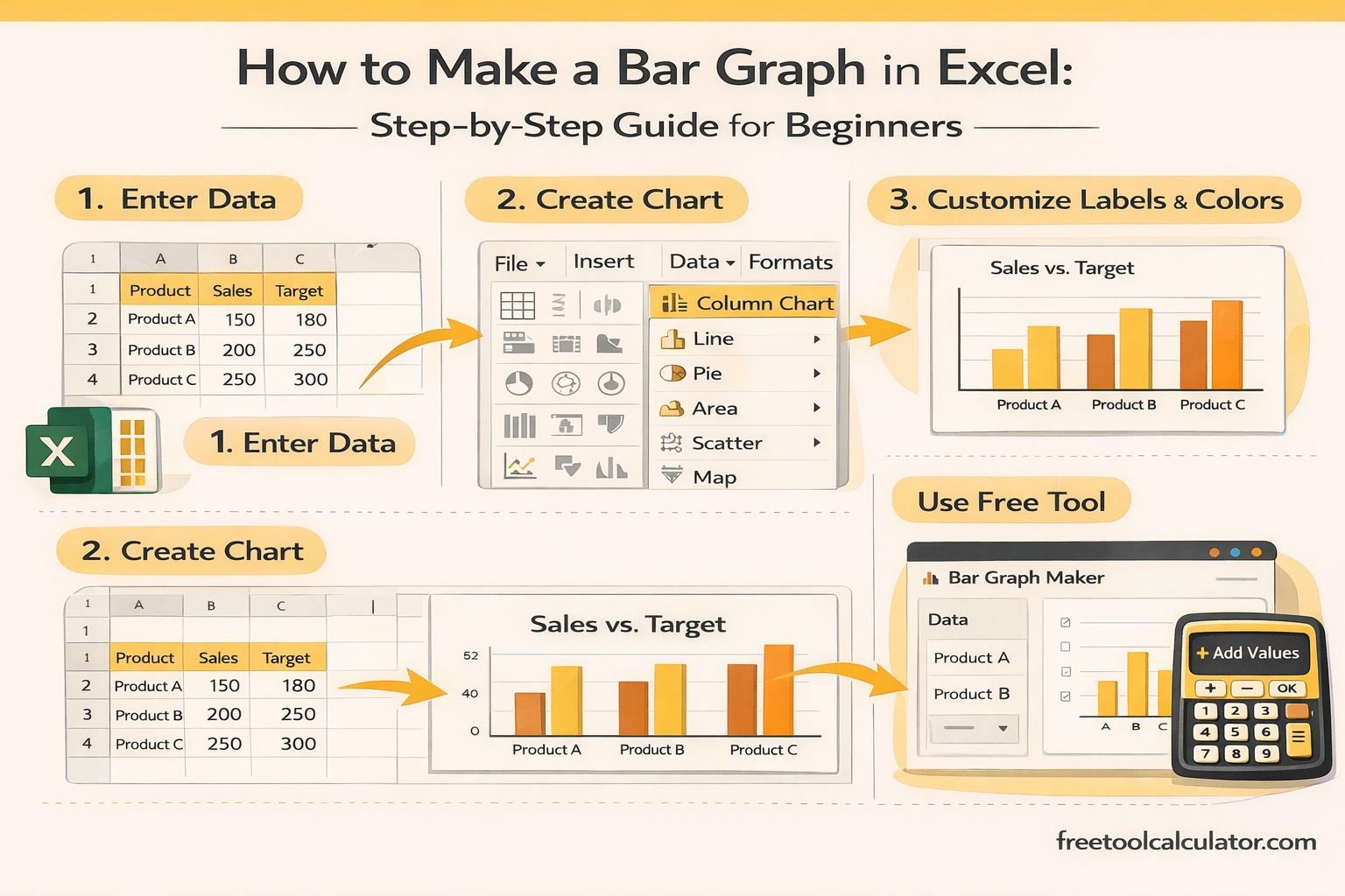
Step 1: Open Excel and enter your data

Before creating any chart, Excel needs a table with your data. Here’s a simple example:

Fruit Quantity
Apples 12
Oranges 7
Bananas 15
Grapes 9

  • Type this into Excel so that column A has your categories (labels) and column B has numbers (values).
  • Put the headings (“Fruit” and “Quantity”) in the first row.

Good data structure makes graphs easier to build and understand.

Step 2: Select your data

Click and drag your cursor to highlight all the cells that contain your data including the headings. Example: drag from A1 to B5. This tells Excel which parts of the spreadsheet you want to use in your graph.

Step 3: Insert your bar graph

With your data highlighted:

Go to the Insert tab at the top of Excel.

In the Charts group, choose the chart type you want.

For a vertical bar graph, click Column Chart and then choose Clustered Column (2-D).

Excel will immediately generate a bar graph and place it on your sheet.

Step 4: Give your bar graph a clear title

Your chart appears with a default title like “Chart Title.” Click on that text and type a useful, descriptive title. For example:

  • “Fruit Sold This Week”
  • “Student Test Scores”

A good title tells the viewer exactly what the graph is about.

Step 5: Add axis labels

Axis labels help anyone reading your graph understand what data you are showing.

  • The horizontal axis (X-axis) shows the categories (e.g., Apples, Oranges).
  • The vertical axis (Y-axis) shows the numbers (e.g., Quantity).

To add axis labels:

Click your chart.

Click the little plus icon (+) next to the chart (Chart Elements).

Check the box for Axis Titles.

Click each axis title on the chart and type a label, such as “Fruit” for the X-axis and “Quantity” for the Y-axis.

Step 6: Add data labels (optional)

Adding data labels shows the actual number on top of each bar. This helps people quickly see exact values without reading the axis.

To add data labels:

Click the chart.

Click the + icon (Chart Elements).

Tick Data Labels.

Now each bar will show its value directly.

Step 7: Customize your bar graph colors

You can change the colors of your bars to make your chart more attractive or easier to read.

Click on any bar.

Right-click and choose Format Data Series.

Select Fill and choose a color you like.

Or use the Chart Design tab → Change Colors to pick a palette.

Keep it simple — too many colors can make a chart look cluttered.

Step 8: Sort your data for better comparison (optional)

If you want your bar graph to display from smallest to largest (or reverse), it’s best to sort your data first:

Highlight your table (A1:B5).

Go to the Data tab → Sort.

Sort by the numbers column (Quantity) and choose ascending or descending.

Your bar graph will update automatically after sorting.

Step 9: Use a Bar Graph Maker tool for quick charts

If you don’t want to build a bar graph in Excel, or you want an online alternative, you can use the free Bar Graph Maker. This tool lets you:

  • Enter your categories and values
  • Customize labels and colors
  • Download or copy the graph instantly

It’s perfect for quick homework, presentations, or sharing graphs without Excel.

Common mistakes when making bar graphs

Even simple bar graphs can confuse people if certain rules aren’t followed:

Mistake 1: Not including headings
Always include clear column titles — Excel uses these for labels.

Mistake 2: Starting the Y-axis above zero
A graph that doesn’t start at zero can mislead viewers about scale.

Mistake 3: Using the wrong chart type
Bar graphs are best for comparing categories. For proportions, use pie charts. For trends over time, use line charts.

Mistake 4: Too many categories
Bar graphs with too many bars get cluttered. Keep it simple if possible.

Tips to make your bar graph look more professional

  • Use consistent colors for the same type of data.
  • Remove gridlines if they are distracting.
  • Add value labels only if they improve readability.
  • Keep titles short and descriptive.
  • Use fonts that are easy to read in presentations.

Practice example: Student test scores

Imagine you have this data:

Student Score
Alex 88
Maria 92
Sam 75
Lily 85

Follow the steps:

Enter the table into Excel.

Highlight A1 to B5.

Insert → Bar/Column Chart → Clustered Column.

Add title: “Test Scores”.

Add axis labels: Students (X) and Scores (Y).

Add data labels.

Now you have a professional graph showing test performance visually.

Why learning to make a bar graph in Excel matters

Bar graphs help you:

  • Summarize data clearly
  • Compare categories quickly
  • Communicate results visually
  • Make reports look professional

Whether you’re doing school projects, business reports, or personal data tracking, knowing how to make a bar graph in Excel is a valuable skill.

Final conclusion on making bar graphs in Excel

Making a bar graph in Excel doesn’t have to be complicated. By structuring your data correctly, using the Insert chart feature, labeling your axes, and customizing your visuals, you can create clear and informative charts in minutes. For quick results without Excel, the Bar Graph Maker tool offers an excellent online alternative that helps you build graphs instantly and accurately.

With practice, you will be able to turn any table of numbers into a visual story that helps you understand and communicate information effectively.

Share this article:

On This Page

Subscribe to our newsletter

Read the latest articles from our experts

Related Posts

Metric Units Conversion Chart Free and Printable Guide

How to Convert Metric Units Easily (Step-by-Step Guide)

Metric unit conversion becomes simple when you understand prefixes and place values. This guide explains the metric system, step-by-step conversion methods, memory tricks, solved examples, and practice questions to help students and professionals convert metric units quickly and accurately.

Calculate Age in Excel: Formulas & Step-by-Step Guide for Accurate Age Calculation

Calculate Age in Excel: Formulas & Step-by-Step Guide for Accurate Age Calculation

Learn how to calculate age in Excel using date of birth formulas, DATEDIF, TODAY, YEARFRAC, and custom spreadsheet methods. This guide explains simple and advanced Excel age formulas with examples, helping you calculate completed years, months, days, and accurate ages for reports, records, and data analysis.

Eastern Time Zone States & Cities (Complete List) EST vs EDT Explained

Eastern Time Zone States & Cities (Complete List): EST vs EDT Explained

The Eastern Time Zone covers a large portion of the United States, including many of its most populated states and cities. This guide explains which states use Eastern Time, how Daylight Saving Time affects the region, and answers common questions about Ohio, Michigan, Maryland, North Carolina, and other eastern states.

How to Calculate Area Complete Beginner Guide

How to Calculate Area Complete Beginner Guide

Learn how to calculate area with this complete beginner guide Understand area formulas for squares rectangles circles triangles and other shapes using simple examples practical applications and free online tools designed to make area calculations accurate fast and easy for students homeowners professionals and everyday users

Hypotenuse Calculator Find Any Triangle Side Easily

Hypotenuse Calculator Find Any Triangle Side Easily

Learn how to use a hypotenuse calculator to find triangle sides accurately This guide explains the Pythagorean theorem hypotenuse formulas practical examples and geometry applications using simple calculations and free online tools for students teachers engineers and everyday problem solving situations

CGPA Calculator Complete University Grade Guide

CGPA Calculator Complete University Grade Guide

Learn how to use a CGPA calculator with this complete university grade guide Understand CGPA formulas grading systems semester calculations and academic performance tracking using accurate methods and free online tools designed for students in schools colleges and universities worldwide

What Is a Scientific Calculator Complete Beginner Guide

What Is a Scientific Calculator Complete Beginner Guide

Learn scientific calculator meaning with this complete beginner guide Understand what is scientific calculator, its functions, uses, and how it differs from basic calculators to help students and professionals solve complex math problems easily and accurately using simple explanations and practical examples

US Time Zone Guide – States, Cities and Map Explained

US Time Zone Guide – States, Cities and Map Explained

Learn everything about the US time zone guide, including states, cities, and maps. Understand time zones in America and how they work. Explore now for a clear and simple breakdown.

Metric Units Conversion Chart Free and Printable Guide

Metric Units Conversion Chart Free Printable Guide

Metric units conversion chart explained with examples and printable guide Use our free tool to convert metric units instantly

How To Find Hypotenuse of a Triangle with Simple Formulas and Examples

How To Find Hypotenuse of a Triangle with Simple Formulas and Examples

This blog explains how to find hypotenuse using formulas, angles, and examples. It covers the meaning of hypotenuse in Algebra I, how to calculate it in right and acute triangles, and how online tools make calculations faster and more accurate for students, teachers, and practical geometry applications.

Tools & Resources

Explore our collection of professional tools designed to streamline your workflow

Report a Bug