Best Font Pairings and Why Typography Matters
Choosing the best font pairings is one of the most important parts of website design and branding. Typography affects readability, visual hierarchy, emotional perception, and overall user experience. Even if a website has beautiful colors and layouts, poor font choices can make the design look unprofessional and difficult to read.
Fonts communicate personality and brand identity. A modern technology brand may use clean sans serif fonts, while a luxury fashion brand may prefer elegant serif typography. The right combination creates balance, consistency, and trust. Great font pairings improve engagement because visitors can consume content more comfortably and quickly.
Website typography also impacts branding across logos, marketing materials, landing pages, ecommerce stores, and social media graphics. Consistent typography strengthens visual recognition and helps businesses appear more professional online.
What Makes Good Font Pairs
Good font pairs create contrast without clashing. The goal is to combine fonts that complement each other while maintaining readability and visual harmony. Usually, designers pair a heading font with a body text font. The heading font creates attention while the body font supports comfortable reading.
One common strategy is combining a serif font with a sans serif font. Serif fonts often look elegant and traditional, while sans serif fonts appear modern and minimal. This contrast creates strong visual balance.
Another important factor is consistency. Font styles should feel connected through proportions, spacing, or mood. Pairing extremely decorative fonts together often creates confusion and hurts readability.
Why Modern Font Pairings Are Important in 2026
Modern web design trends continue evolving toward cleaner layouts, improved accessibility, and mobile friendly readability. Modern font pairings now prioritize clarity, responsiveness, and fast loading performance alongside aesthetics.
In 2026, websites are increasingly designed for multiple devices including phones, tablets, ultrawide monitors, and smart displays. Fonts need to remain readable across all screen sizes. Minimal and flexible typography systems have become more popular because they adapt well to responsive design.
Modern font pairings also focus heavily on user experience. Visitors now expect websites to load quickly and present information clearly. Clean typography helps reduce bounce rates and improves overall engagement.
Best Font Pairings for Professional Websites
Professional websites often use typography combinations that balance readability with authority. One popular approach is pairing a bold sans serif heading font with a highly readable body font.
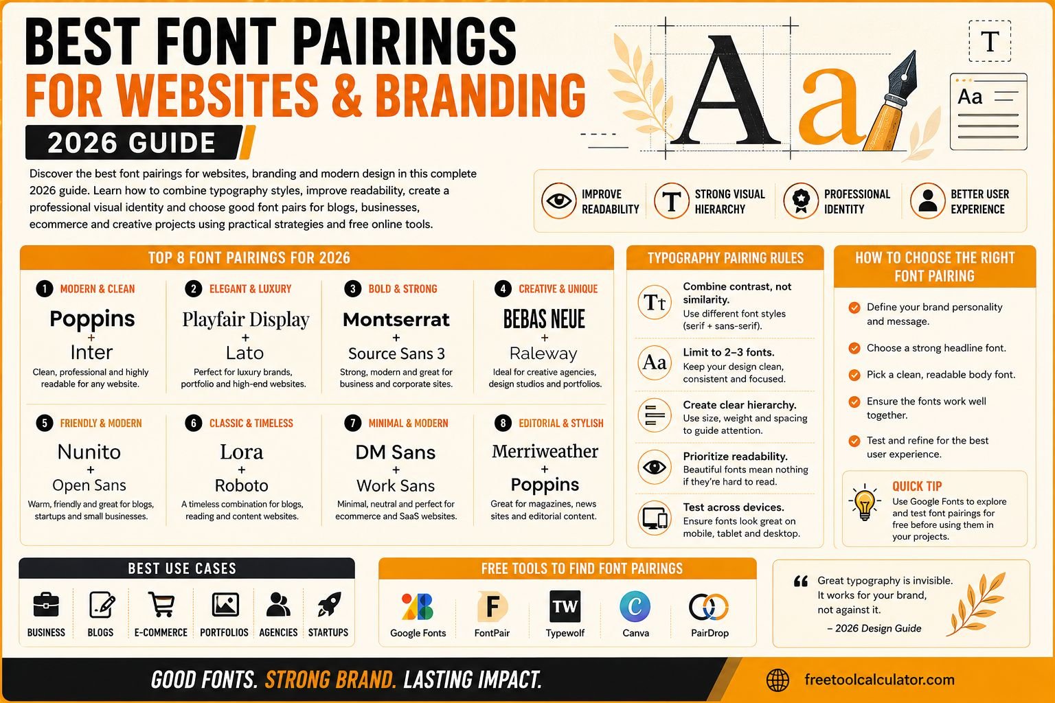
For example, pairing Montserrat with Open Sans creates a modern and professional appearance. Poppins with Roboto is another popular combination for startups and digital businesses because it feels clean and contemporary.
Businesses that want a premium or editorial appearance often combine Playfair Display with Lato or Merriweather with Source Sans Pro. These combinations create elegance while maintaining readability.
Typography should always support the brand identity and target audience rather than simply following trends.
Website Font Pairings for Blogs and Content Sites
Blogs and content focused websites require highly readable typography because users spend long periods reading articles and guides. Body text readability becomes more important than decorative styling.
One of the best website font pairings for blogs is Merriweather with Open Sans because it combines classic readability with modern simplicity. Another strong option is Georgia paired with Helvetica or Inter.
Long form content benefits from fonts with comfortable spacing and balanced letterforms. Thin or overly stylized fonts may look attractive initially but become tiring during extended reading sessions.
Using typography correctly improves reading flow and encourages visitors to stay on the page longer.
Best Font Pairings for Ecommerce Websites
Ecommerce websites require typography that supports product visibility, trust, and conversions. Fonts must remain clean and readable while highlighting prices, product names, and calls to action effectively.
Sans serif combinations are commonly used in ecommerce because they appear modern and easy to scan quickly. Popular ecommerce font pairings include Poppins with Nunito, Roboto with Lato, and Inter with Work Sans.
Luxury ecommerce brands often use elegant serif headings combined with simple body fonts for a premium appearance. Typography choices should always align with product style and audience expectations.
Clear typography improves shopping experience and helps users navigate products more efficiently.
How Branding Uses Great Font Pairings
Branding depends heavily on typography because fonts influence emotional perception. A playful brand may use rounded typography, while corporate brands usually prefer clean and structured fonts.
Great font pairings strengthen visual identity across websites, business cards, advertisements, packaging, presentations, and social media graphics. Consistent typography creates familiarity and improves recognition over time.
Strong branding systems usually limit typography to two or three fonts maximum. Using too many fonts creates inconsistency and visual clutter. Simplicity often creates stronger branding impact than excessive styling.
Typography should reflect the company personality, industry, and audience expectations.
Serif vs Sans Serif Font Pairings
Serif fonts include decorative strokes at the ends of letters, while sans serif fonts do not. Serif fonts often appear traditional, elegant, and trustworthy. Sans serif fonts feel modern, minimal, and digital friendly.
Combining serif and sans serif fonts creates natural contrast and hierarchy. For example, using Playfair Display for headings with Open Sans for paragraphs creates sophistication without sacrificing readability.
Sans serif only combinations are also popular for modern websites because they appear clean and responsive on digital screens. The best choice depends on the overall brand style and website purpose.
Common Typography Mistakes in Web Design
One of the most common mistakes is using too many fonts on the same website. Excessive typography variation creates visual inconsistency and distracts users from the content.
Another mistake is choosing fonts based only on appearance without considering readability. Thin or decorative fonts may look attractive in logos but perform poorly for paragraphs and mobile devices.
Poor spacing and incorrect font sizes also reduce readability. Typography should always prioritize user experience over visual complexity.
Using inconsistent heading styles across pages is another issue that weakens branding and hierarchy.
How Font Pairings Affect SEO and User Experience
Typography indirectly affects SEO because user experience influences engagement metrics such as bounce rate and session duration. If visitors struggle to read content, they may leave quickly, reducing website performance signals.
Readable typography improves accessibility and helps users consume information more comfortably. Search engines increasingly value websites that provide positive user experiences across devices.
Fast loading fonts also improve website performance. Heavy or poorly optimized font files may slow down pages and negatively affect Core Web Vitals.
Good typography supports both design quality and technical website optimization simultaneously.
Best Google Font Pairings for Modern Websites
Google Fonts remains one of the most popular font resources because it offers free web optimized typography options. Many modern websites rely on Google Fonts for performance and accessibility.
Popular Google Font pairings include:
Poppins and Roboto
Montserrat and Open Sans
Playfair Display and Lato
Inter and Source Sans Pro
Merriweather and Nunito
These combinations work well because they balance readability, contrast, and responsive design compatibility. Choosing widely supported fonts also improves loading reliability across browsers and devices.
How to Choose the Right Font Pairing for Your Brand
The best font pairings depend on your audience, industry, and brand personality. A law firm website requires a different typography style compared to a gaming brand or creative agency.
Start by identifying your brand tone. Is it modern, elegant, playful, luxury, minimalist, or technical. Then select fonts that visually communicate that identity.
Always test typography across desktop and mobile devices before finalizing designs. Fonts that look excellent on large screens may appear cramped or unreadable on smaller displays.
Balancing aesthetics and functionality creates stronger long term branding results.
Useful Design Tools for Typography and Branding
Typography works best when combined with strong visual design systems including spacing, colors, layout consistency, and accessibility standards. Designers often use online tools to test combinations and improve overall branding quality.
You can use the color contrast checker to ensure typography remains readable against background colors. The PNG JPG to WEBP converter is also useful for optimizing branded graphics and typography based design assets for faster website performance.
Combining typography tools with accessibility testing helps create more professional and user friendly websites.
Typography Trends for Websites in 2026
Typography trends in 2026 focus on minimalism, accessibility, responsive scaling, and clean visual hierarchy. Variable fonts are becoming more common because they improve flexibility and reduce file sizes.
Large bold headings combined with simple body text continue dominating modern web design. Soft rounded fonts are also increasing in popularity because they create approachable and friendly branding.
Dark mode optimized typography is another growing trend because more websites now support multiple viewing modes. Fonts must remain readable across both light and dark backgrounds.
The overall direction of typography continues moving toward clarity, usability, and performance.
Conclusion
Choosing the best font pairings is essential for creating professional websites, strong branding, and better user experiences. Good font pairs improve readability, establish hierarchy, strengthen brand identity, and help websites feel modern and trustworthy. Whether building a blog, ecommerce store, business website, or portfolio, typography plays a major role in how visitors perceive your content and brand.
For better design consistency and accessibility, you can also use the color contrast checker alongside typography planning to improve readability and overall visual quality across your website and branding materials.